Mapping the evolution of the most dangerous areas of Los Angeles for pedestrians and bicyclists

I recently started biking…in Los Angeles. Los Angeles could be one of the most bike-friendly cities in the United States: it boasts plenty of annual sunshine, it has a mostly flat terrain, and quite mild weather. Unfortunately, many parts of the city lack proper bike infrastructure, making it dangerous when it comes to traffic collisions and traffic violence. In 2021, over 230 people lost their lives to the streets of Los Angeles.

With this in the background, I wanted to figure out the most dangerous streets in Los Angeles. I had been following the Streets For All Twitter account for a while and knew that they had a bot which posted any traffic violence against involving pedestrians or bikes. This account had records dating back to just over one year. So I started with that (old results here). I used the Twitter API to extract all of the Tweets from the bot account, and then used the Google Maps API to convert the text-based location to a series of latitude and longitude.

I soon stumbled upon LA City’s records, dating back 2010-Present. This uses MO codes to detail the accident. After converting the MO codes for vehicle collision with pedestrian, and bikes, I had all the data needed to plot all collisions:

Overall traffic collisions, 2010-2020. Source: LA City.

For plotting, I am using Plotly with the Mapbox API.

How does this look year over year since the data started? First, a quick decline occurs after 2013 followed by similarly looking collision patterns year over year. We can see some streets always have a a dense amount of collisions. Venice, Figueroa, Pico, Olympic, Wilshire, Santa Monica and Vermont appear to be big incident street year over year.

Animated year over year traffic collision patterns.

Of course, many have pointed out that the pandemic has switched typical traffic flows for city, as such, here is the pre-pandemic vs. post-pandemic collision map densities:

2017-20202020-2022
No big visual difference in pre- vs post-pandemic traffic collision patterns.

Just because a street has more absolute collision does not mean it has increased probability of collisions. To capture the probability of collisions, I’m going to make an assumption: that streets with more vehicular traffic should have more chances of vehicle-pedestrian interaction, so if I normalize the collision by the traffic flow, I should arrive at a value that is more representative of the probability of collision.

Luckily, LADOT has data on such traffic volume. Unfortunately, this data appears to start in 2011 and stop in 2016. It does not survey the same street year over year and seems sporadic in the streets surveyed over time. It has not been updated since 2016 giving a mixed snapshot of the traffic throughout Los Angeles.

The first plot will assume that the traffic from 2011-2016 more or less is constant throughout the collision data from 2010-2020:

Overall collision probability map: Is Silver Lake one of the most dangerous places to bike in the last decade? (arbitrary units, higher means higher probability)

To make a plot like this I had to engineer a trick: the data from the traffic flow does not overlay perfectly from the data from collisions, naturally. In order to be able to divide both data I needed to figure out an interpolation scheme for each. For traffic flow data I did a ‘nearest’ interpolation grid approach. I did this for two reasons, first I thought of the traffic flow data as a ‘graph’ in that the flow from one point to its nearest neighbor must be related: cars must travel between these points to an extent. The other reason for this interpolation, is that unlike the collision data, the traffic data was rather dense (in my opinion). For the collision data I opted for a Kernel Density Estimation (KDE) approach. Here, I made the assumption that an area near a collision point must be less safe, and thus a collision within a certain radius of another collision, is more likely to occur.

In the second plot, realizing that we have a snapshot of a traffic count done late 2016 (600+ intersection), and we also have collisions for just 2016, we will repeat the plot with just the snapshot for the 2016 year:

Just the 2016 data: dangerous centers appear in Calabasas, Koreatown, South LA, Venice, Boyles Height, North Hollywood. (arbitrary units, higher means higher probability)

We will do the same thing with 2015, 2014, 2013, 2012, and 2011, but animated to see how the most dangerous areas changed over time:

We can see year over year variation in probability of collisions, however some areas are highlighted throughout most of the year: Koreatown, Silverlake, South LA, East LA.

Using Named Entity Recognition and Natural Language Processing to build a map of accumulated infections of n-Cov2019

I begin by scraping the following website for all its information and translating the text using Google Translate API: https://ncov.dxy.cn/ncovh5/view/pneumonia_timeline?whichFrom=dxy

The data consists of a header, a description, a timestamp of some sort, and the source from where the information came from. Using the HTML library in Python I extracted these various sections of the page and place it into a Pandas Dataframe.

After some cleaning, I used “Named Entity Recognition” to extract locations from both the descriptions and the titles. Since location is such a common use for NER, I decided to use an already existing model: DeepPavlov. I loaded this model and extracted all the locations and put them in their own Pandas columns in the data frame.

Next, I need to extract the latitude and longitude from the name of these locations. Using GeoPy, I extracted and averaged all the locations in both the header and description. For now, I opted to use only the location information in the header as from a quick glance, this tends to be the main region or entity where the cases happened, rather than the city levels or entities that might have tested the case in the descriptions.

Now, I was left with my ultimate bottleneck, text in the description like this:

“From 00:00 to 24:00 on January 31, 2020, Shanxi Province reported 8 new confirmed cases of pneumonia due to new coronavirus infection. As of 14:00 on January 31, 47 cases of pneumonia confirmed by new coronavirus infection have been reported in 11 cities in Shanxi Province (including 2 severe cases, 1 critical case, 1 discharged case, and no deaths). At present, 1333 close contacts have been tracked. 41 people were released from medical observation on the same day, and a total of 1101 people were receiving medical observation.”

From this I’ve already extracted this information:
Time: January 31, 2020
Location: Shanxi Province
However, I still need to extract the following information
New cases: 8 new confirmed cases of pneumonia (8)
Accumulated cases: 47 cases of pneumonia confirmed (47)
New deaths: no deaths (0)

In order to approach this, I needed to train a custom NER model. I used TagTog’s tagging and AI tool to do this work:

TagTog: Annotation Tool

This makes it easy to train by selecting the various information in a document. I created 8 entities and 4 relationships:

Entity Description Relations
new_case_I New case added in location New cases and it’s number
new_case_N Number of new cases
acc_case_I Accumulated case in region Accumulated cases and its number
acc_case_N Number of accumulated cases
new_death_I New death recorded in region New deaths and its number
new_death_N Number of new deaths
acc_death_I Accumulated death in region Accumulated deaths and its number
acc_death_N Number of accumulated deaths

I manually tagged 20% of the data to build the model. From this, I parsed the rest of the data through the model to extract the remaining information. From the initial document example, the model extracted the following information:

Text Entity Probability
‘no’“accumulated_death-N” 0.874
‘8’“new_case-N” 0.838
‘no deaths’“accumulated_death-I” 0.698
‘1’“new_death-N” 0.621
‘1’“new_death-N” 0.550
’47’“accumulated_case-N” 0.813
’41’“accumulated_case-N” 0.714
‘8 new confirmed cases’“new_case-I” 0.842
’47 cases of pneumonia confirmed’“new_case-I” 0.640

We can see that the model with 20% of the data did fairly well. Numerically, we were able to pick up the correct new case number (8) and the correct accumulated case number (47).

With the rest of the data parsed, I used Plotly to build a final heatmap (data from morning of 01/28). We can see from this that the model has clearly picked up the epicenter and the surrounding virus activity nearby.

Heatmap of nCov2019 Accumulated Infections as of 01.28.2019

I plotted the accumulated cases over time:

Accumulated cases over time for nCov2019 Infections

Finally, I made a GIF heatmap of the virus activity over time (note the scale bar changes overtime):

Animated heatmap over time. Scalebar changes overtime.

Future:
In the imminent future, I plan on releasing a Flask app on my website with the data, stay tuned! Additionally, I will update it with the most recent data released from 01.28.2020.

Using a distributed database system (blockchain) as a way to control peers in a network

Background:

In my first year of undergrad, I worked at iD Tech Camp. I taught game design, Java programming and a few other technical and computer science classes to primarily middle school-aged students. Consequently, with a computer at their fingertips, many of these students would wander off on the internet or play computer games. To overcome this, I built a Java-based application that would connect to, at the time, this new service called Firebase and load various commands that I could insert on my version of the app. I could at the touch of a button close anyone who had a browser window open, blackout a computer screen, send a file to a computer and more.

Main concept:

In order to understand some of the concepts behind blockchain a bit better, I decided to make my own Python-based blockchain, with Flask as a REST API package, for peers on my network to communicate to each other.

I wanted to attempt the same concept as I did at iD Tech Camp, but using an immutable, distributed, database system (ie. Blockchain) to store my commands.

The framework behind the code is that if the seed URL does not currently host a blockchain (ie a valid REST request cannot return a blockchain JSON) then the genesis chain is created, and the peer gets a “TEACHER” role. The password for this role (using a sha256 library) is saved at that peer. Only a person with this username and password combination and this teacher role can add blocks to the chain.

Anyone who connects to this blockchain automatically gets assigned a “STUDENT” role, and anyone who connects to any peers on this chain also gets assigned a “STUDENT” role. Anyone can point a REST request at any peer on this chain to add a block (with the right user/password combination) with a list of commands and more.

When a block sits unconfirmed on a peer, the peer keeps “solving” it until it can be added to the blockchain. Here, since the point is not to solve a complex problem, like traditional blockchains, rather, the problem is simple as there is enough built-in security to make the chain immutable. Proof of Work: the sha256 library creates a hexadecimal string from the block object with a dynamic variable that changes until the hexadecimal string matches certain requirements. Since this problem is not too complex, it will not take more than one second. Once the peer has solved the block, it sends the block and the answer to everyone who is connected to it and so forth:

Because every peer is connected to another peer, once a peer solves a block, the block is broadcasted across the peers so each peer can add it to their local chain.
Data structure for a block with commands.

Built-in security and drawback:

The way authentication works on the chain is that every time a new peer (N) connects to an existing peer (E), that existing peer (E) now hosts the password for the new peer (N) on the chain. Whenever N needs to authenticate again, it can connect to any peer on the network, but these peers pass on the requests for authentication to the other peers until it reaches E. E then decides if the authentication is correct. This has built-in security because it means the password is delocalized – it is not stored in some central peer or select few peers. Furthermore, the password is never transmitted over the network, it is only known by E and the N.

The drawback is obvious, if E every goes offline, the peer N can no longer authenticate on the chain and must get a new identity. In future versions, the credentials could be stored in E as well as a trusted or random backup peer.

A modular approach to commands:

The code approaches commands in a modular way. A command can simply be written as a Python package and dropped in the ‘mods’ folder. This allows the opportunity to decide the level of complexity as well as ‘access’ each peer has on the network. It also allows peers to block the ability of the chain to run a command locally. It also makes it easier to add functionality and maintain the codebase. As long as a command with a module name matches a Python package in the ‘mods’ folder, the command can be executed.

Future:

In the future, I plan to make use of back up peers for hosting the password in case a peer goes offline. Additionally, I plan on using the ‘inspect’ features of Python to decide if a peer is trusted enough to connect. This can be used to ensure that the codebase that connects to the network is the same that the network is running.

The code is available on my GitHub: https://github.com/mhsiron/Crypto_CControl/

Is the nation more divided? A new polarization metric.

I analyzed over 12000+ job approval polls split between adult democrats and adult republicans to extrapolate how ‘polarized’ the US became over time.

I propose a simple ‘dis-unity’ ratio that is the job approval percentage by the party in charge over the job approval percentage by the opposing party. The lower the number, the more united each party members are in their view of the president, while the higher the number, the more dis-united the party members are in their view of the current president.

Here is the result from Obama’s 2 terms and Trump’s 1st up to February:

Some key findings:

  • Obama started with a more united America in his first term than Trump’s first term or Obama’s second term.
  • During Obama’s first term, the country became more divided
  • During Obama’s second term, the country became more united

Caveat: This ratio does not allude whether the current president is generally liked or disliked at any time, it only alludes the disparity between both party member’s perception of the current president, and thus gives an insight into the polarization of the nation during a presidency.

I am awaiting data from other presidencies to see if there is a general trend between presidents or over time. I will also add major events in the timeline that might account for some spikes.

Using TensorFlow’s CNN vs. SKLearn’s Decision Tree Regressor

Background

After a semester at UC Berkeley learning various machine learning and data science tools, I’ve decided to re-examine the model I built half a year ago to predict the remainder of the primary elections at the time.

I will be using the same key data:

  • Geographic Region
  • Election type (primary vs. Caucus, open vs. Closed)
  • Demographics

In the previous model, I was using overall state-based demographic data since I did not have the computational skills at the time to handle more than 50 rows of data. However, with the Python skills I acquired over the semester, I decided to improve my model by adding more demographic and election data by using county level information provided by the US Census Bureau.

Instead of manually deciding which variables I think would exert the most influence on my model, I decided to let the model figure it out. I tried using both TensorFlow’s Convolutional Neural Network (CNN) using the Keras wrapper, as well as SKLearn’s Decision Tree Regressor.

Explanations of Algorithms

There is a key difference between the two algorithms:

Decision Trees Convolutional Neural Networks
 
How it works:

Decision trees can be thought as a collection of ‘if-then’ statements. They take an input data set and try to match the output data-set through a tree-like structure of if-then statements. Each node on the tree is known as a ‘leaf’ and each leaf assigns a value in a regression tree. The algorithm finds the best place to create a split in order to minimize the loss function (error) in the actual output vs. the output the decision tree creates. This is very similar to the game of 20 questions – you have to find the best questions in order to optimize the tree for new, unseen data.


Neural networks are fundamentally different from decision trees. Rather than being ‘linear’ in their progression, from starting input to ending output, the data goes back and forth between ‘neurons,’ before returning to the output layers. However, having very large inputs will create very large number of hidden neurons between the input and output layer. To reduce the number of neurons, we create a convolutional neural network. In a CNN, an input layer is reduced to one neuron as it progresses through each layer. Additionally certain variables might add weight on others in the network.

Problems:

One major problems with decision trees is over-fitting your training data. While over-fitting might results in 100% accuracy with your training data this could leave to catastrophic results with unseen data. One way to limit overfitting is by limiting the depth of the nodes, or pruning (removing random leaves) after overfitting

Problems:

CNNs are an active area of research and are still poorly understood. They are often over specified for very specific data and might not work well on new data. This is because its hard to predict or figure out which type of layer, or activation function might work best for certain applications. Often people will build two completely different architecture of CNN that will work well with some data sets but not up to par with others.

I decided to do a CNN instead of Recurrent Neural Network (RNN) because I believed my input data to not have much inter-correlation between each features. However, I will be testing an RNN in the future because I am still curious about the possible results.

Model Summary

I began by creating a data set that combines the county vote results with the demographic and election data. I then separate the data into states that had already had their elections by March 22nd, and states that had yet to hold an election. I only took into consideration the democratic primary results. I further split the data into an 80% train-test ratio to not overfit both models.

For the CNN model, I built the model using 4 dense layers, with a sigmoid, softmax, and hyperbolic tangent activation layers. These layers are friendly to continuous, regression data. This created a model with almost 70 thousand parameters.

For the decision tree, regression model, I set the max depth to be 30 leafs, so as to not over-fit, and set the maximum features to be the square-root of the input features. I also used sklearn’s AdaBoostRegressor. This helps with continuous data as it provides a smoother output instead of a step-function output, by superimposing multiple decision tree (in my model, 1000 decision trees).

Results

To visualize the results, I created an output graph for each model of the predicted vs actual election results. The more accurate, the more the slope would approach unity:

Decision Tree Regressor Convolutional Neural Network
   
Mean Error Mean Error
+1.19% -6.54%

Here is the state by state prediction error for both models:

State DTR Predict Err (%) CNN Predict Err (%) Actual (%)*
California +17.6 +2.44 41.5
Delaware +7.45 -10.63 39.3
Indiana -1.86 -4.50 54.3
Kentucky -10.16 -15.54 49.5
Maryland -0.66 -9.93 30.2
Montana +0.95 +1.85 48.3
New Jersey +10.80 -3.02 36.5
Oregon +8.51 -0.15 58.7
Pennsylvania +4.11 -5.11 34.3
Rhode Island -1.87 -21.67 50.4
South Dakota +8.92 -0.57 49.8
West Virginia -16.27 -21.90 52.8
Wisconsin -2.33 -12.05 59.2
Wyoming -3.44 -3.97 56.3


While the error for the DTR model was more centered about zero, it provided more catastrophic results (above 5% error) than the CNN model. If the CNN model was linearly calibrated by 6% at the very end, it would have had two less catastrophic results, and would have been significantly better. Overall, both of these models resulted in more problems than the state-wide analysis. I attribute more data to more error as perhaps a case of Simpson’s Paradox.

However, perhaps by combining a linear combination of these two models, an even better model could be made than the previous model with just state-wide data. There are many more variables that I could further explore in the DTR and CNN library as well, that could perhaps optimize this model further.

*This calculation was achieved by weighing each county’s population with their votes, which may not be the same results from the published voting results by the state but is more accurate for the data used in these models.

Interesting connection – GOP vs. DNC

Just for curiosity, I decided to run the same CNN and DTR model on the GOP:

Decision Tree Regressor Convolutional Neural Network
   
Mean Error Mean Error
-18.02% -17.4%

Both of these models outputted predictions with significantly greater error. I interpret this to mean that democratic voters fit more ‘neatly’ into specific demographic groups outlined by the census data than GOP voters.

Interesting connection – weights

I decided to further analyze in the DTR Model which variables were most prominent in calculating the percentage of votes received to each candidate in the DNC primary.

I outputted the weights from the trained DTR Model:

Variable Description Weight
Type What type of election was
held (primary or caucus)
0.025561
RHI125214 White percent 0.027758
AGE135214 Person under 5 yrs, percent 0.028681
Open Whether the election was
opened or closed
0.028841
LND110210 Land area 0.029259
RHI525214 Native Hawaiian/Other
Pacific Islander percentage
0.036283
RTN131207 Retail sales per capita 0.040708
HSG495213 Median value of housing
units
0.050376
RHI225214 Black or African American
percentage of population
0.069465
Region In which geographic region
of the US the election was
held
0.249174

The region of the voter has a significantly greater impact (by one order of magnitude) on the results. As expected, the geographic south and west voted very differently in the democratic primary. Perhaps less expected, was the importance of the election type (open, closed, caucus, primary) as well as the racial make-up and certain odd economic factors (retail sales, median value of housing) of each county.

If you would like to see my Jupyter notebook or data set, please contact me!

Predicting a US Primary Election


This primary season has been rather interesting to say the least. There is a former TV reality star running a show, spewing words that would be normally an automatic disqualifier if mentioned by previous candidates in previous election cycles. There exists a particularly angry voter base that scapegoats their fears and economic insecurities – often with understandable sentiments – at a ruling class they perceive as the establishment. You have people fixated on the character and honesty (or appearance of honesty) of candidates rather than their policies. And, as with the ’08 election cycle, you have a sense of hope in some candidates, as well as a sense of unsettledness about the possible nominees from the two major parties. The character of this unsettledness could perhaps be best described by these recent polls:

1 in 4 affiliated republican say they could not vote for the GOP nominee if said nominee was Trump[1]. 33% of Sanders supporters, according to a McClatchy-Marist poll would not vote for Hillary if she was the nominee[2], and 25% of voters would abstain from voting for one of the major party candidates if the nominees were Trump or Clinton[3]. It sure is an election of unique perspective, and uneasiness.

For me personally, this election was the first time I realized how much math is actually involved during an election year. However, for me, it’s not the polling which is of actual interest but rather some of the commentaries made by political pundits following each contest:

  • Bernie does better in primarily white, non-diverse states
  • Hillary does better among older and richer voters
  • Bernie does better among independents, and in open/same day registration contests
  • Bernie does better in caucuses.

What if based on the last 38 contest that happened in U.S. states (excluding territories, democrats abroad, etc) we could provide a model to predict not just whether Bernie or Hillary wins one of the next 14 contest, but perhaps also the margin by what each candidate will win by. (This will be focused on the Democratic primary).

This is exactly what I propose in this post.

The first weight factor I will propose is one that is based entirely on the logistics of the contest:

  • Is it a primary or caucus?
  • Is there same day registration?
  • Is it an open or closed contest?
  • What region is the contest held in?

For each of these factors I assign certain value of “pro-Bernie” points, or logistical information which I believe would provide Bernie a contest where he would perform better:

Factor Comment and Value
Primary or Caucus? Because Bernie does much better in caucuses, I will arbitrarily assign a caucus an additive value of 4.
Same day registration or registration with a deadline? Same day registration drastically helped Bernie. I assigned this an arbitrary, additive value of 3.
Open or closed contest? It was noticed that this had no effect on how well Bernie did in previous contests.
Region (South, West, N.E., Midwest) South – (-1)

NE – (2)

Midwest – (3)

West – (5)


Here are the 39 contest summarized by election factor, to understand why I picked these values:


Region Count Average of Bernie vote
South 13 31.38462
West 3 74.7
Midwest 14 57.65
N.E 9 52.66667
Primary Type Count Average of Bernie vote
Caucus 13 64.87692
Primary 26 41.14615
Open 23 48.26522
Closed 16 50.19375
Same day 14 61.42857
Deadline 25 42.128


There is a clear correlation between the region the contest is held in, as well as whether it’s a caucus or primary, and whether there is same day registration or not. However, whether or not the primary was open or closed did not appear to have a significant effect (perhaps it’s more of a bundled factor with whether or not the registration was on the same day and the primary was open vs. the opposite).

Here is how I divided each state by region in the US:

Each of these components would then be added into an “Election” Factor (EF), which when plotted against actual percentage of votes Bernie gathered in the state would yield to the following curve:

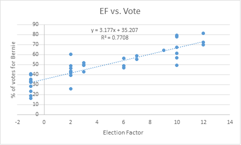
This gave a positive correlation with rather decent R2 value.


Now let’s get into the demographics of the state

The first “trend” that I often hear by political pundits is that Bernie does better in rural states. So I tested this hypothesis directly by comparing a graph of population density by state vs. the percentage of votes Bernie received in that state:

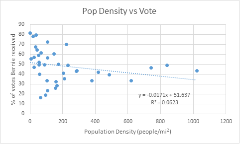
This was a rather weak trend, with a rather low R2 value that I decided to dismiss this factor into my final calculations. I guess the pundits aren’t always right?


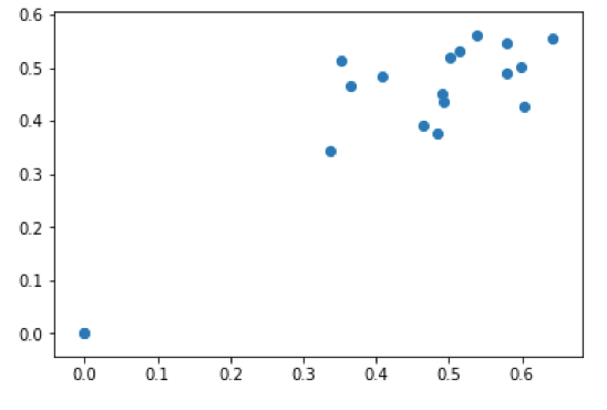
Next demographic of interest is race, which surprisingly shows a rather strong correlation with the percentage of votes Bernie received. Often during the primary race I heard that “Bernie won that states because it’s a mostly white rural state.” Well we already threw out the rural hypothesis, but maybe the white one has some truth to it. So I decided to plot the percentage of white population of a state vs. the percentage of vote Bernie received:

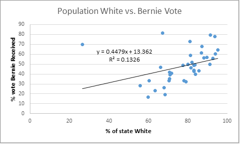
This demonstrated a slightly weak, but none the less non-ignorable trend between the lack of racial diversity in a state and the amount of votes Bernie received.


Now let’s do the same with the black population per state:

Now that’s a rather strong correlation…

Let’s do the same with the Asian population:

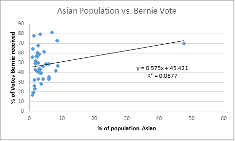
Again, not a huge correlation, although it’s worth notice that Bernie is not uniquely strong in diversity-lacking state, he did very well in Hawaii, a state that’s only 26% white.

What about the Hispanic vote?

With such a low correlation, it is safe to say that the Hispanic population in a state does not show a noticeable effect on the percentage of vote Bernie wins in that state. I’m going to rule this out of my model.

Now I will put all of the racial demographic variables together into a “Race” Factor:

Where mi, bi, R2 is the slope, intercept and R2 of the specific population segment i (white, black, asian). Pi is the actual population percentage of the segment i of interest. ai is an arbitrary coefficient of influence I designated based on how much influence each population segment had on the overall trend (1 for white, ½ for asian and 2 for black).

I then scaled the values so that they would be the same order of magnitude as the election factor (1-10). The highest value of the E.F. was 12, so I wanted the highest value of the RF to also be 12.

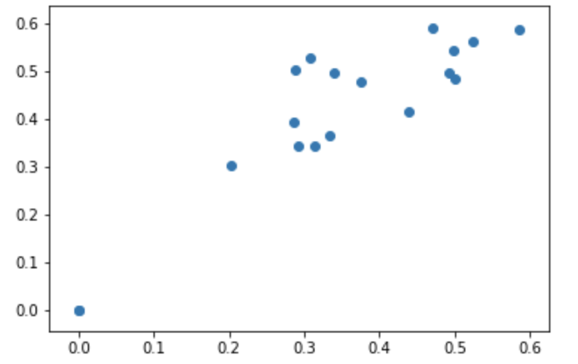
This yields an RF value vs. Bernie vote curve of:

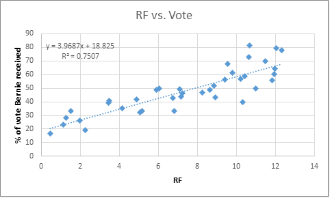
This gives a rather positive and strong correlation with R2 of 0.75.

Now let’s combine both factors into a final score per state (FS):

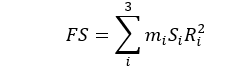
In this Si is one of the two factors of interest (EF, RF). I decided to remove the data point for Vermont as it was an outlier in my data (confirmed by a simple Q-test). The most likely explanation for Vermont is that as Bernie’s home state it gave him a much higher advantage unaccounted for in the E.F.

This gave me a final FS vs. percentage of vote for Bernie curve of:

This shows a very strong correlation between our engineered FS factor and the vote that Bernie received.

Now, we can test the remainder of the states:

States Total Delegates Registration Type Region EF % White Black Asian RF2 FS Bernie
California 475 Deadline Primary West 5 79.07 7.45 13.47 9.0 42.8 53.2
DC 20 Same day Primary N.E 5 37 47 4 0.0 14.9 34.9
Indiana 83 Deadline Primary Midwest 3 84.3 9.1 1.6 8.2 34.5 47.7
Kentucky 55 Deadline Primary Midwest 3 84 8 3 8.7 36.0 48.7
Montana 21 Same day Primary Midwest 6 90 1 0 12.2 55.9 61.8
N Dakota 18 Same day Caucus Midwest 10 88 2 2 11.7 66.1 68.6
NJ 126 Deadline Primary N.E 2 58 13 9 6.6 26.4 42.4
NM 34 Deadline Primary South -1 40 2 0 11.7 33.3 47.0
Oregon 61 Deadline Primary West 5 76 2 6 11.7 51.2 58.7
SD 20 Deadline Primary Midwest 3 85 2 0 11.7 45.2 54.8
West Virginia 29 Deadline Primary South -1 92 3 0 11.1 31.7 45.9


The ones highlighted in green are the ones I predict he will have a definite victory. The yellow could go either way and the red I predict he will perform poorly in. This is entirely based on election logistics and demographics of the state.

I guess we will find out May 3rd when Indiana is up. Right now, according to polls, Bernie is behind by 6.6% points[4]. My model predicts he will lose by 4.6%. This agrees pretty well with the polls. Check back this chart May 3rd to see how my model holds up!


Resources:

[1]http://www.rasmussenreports.com/public_content/politics/elections/election_2016/no_trump_no_show_for_33_of_gop_voters

[2] http://www.wsj.com/video/poll-33-of-sanders-supporters-wouldnt-vote-for-clinton/69C05055-85FE-4320-8D02-3EAC972CACD0.html

[3]http://www.rasmussenreports.com/public_content/politics/elections/election_2016/24_opt_out_of_a_clinton_trump_race

[4] http://www.realclearpolitics.com/epolls/2016/president/in/indiana_democratic_presidential_primary-5807.html