I begin by scraping the following website for all its information and translating the text using Google Translate API: https://ncov.dxy.cn/ncovh5/view/pneumonia_timeline?whichFrom=dxy
The data consists of a header, a description, a timestamp of some sort, and the source from where the information came from. Using the HTML library in Python I extracted these various sections of the page and place it into a Pandas Dataframe.
After some cleaning, I used “Named Entity Recognition” to extract locations from both the descriptions and the titles. Since location is such a common use for NER, I decided to use an already existing model: DeepPavlov. I loaded this model and extracted all the locations and put them in their own Pandas columns in the data frame.
Next, I need to extract the latitude and longitude from the name of these locations. Using GeoPy, I extracted and averaged all the locations in both the header and description. For now, I opted to use only the location information in the header as from a quick glance, this tends to be the main region or entity where the cases happened, rather than the city levels or entities that might have tested the case in the descriptions.
Now, I was left with my ultimate bottleneck, text in the description like this:
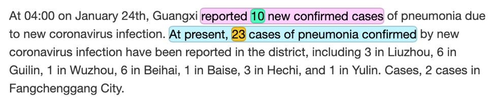
“From 00:00 to 24:00 on January 31, 2020, Shanxi Province reported 8 new confirmed cases of pneumonia due to new coronavirus infection. As of 14:00 on January 31, 47 cases of pneumonia confirmed by new coronavirus infection have been reported in 11 cities in Shanxi Province (including 2 severe cases, 1 critical case, 1 discharged case, and no deaths). At present, 1333 close contacts have been tracked. 41 people were released from medical observation on the same day, and a total of 1101 people were receiving medical observation.”
From this I’ve already extracted this information:
Time: January 31, 2020
Location: Shanxi Province
However, I still need to extract the following information
New cases: 8 new confirmed cases of pneumonia (8)
Accumulated cases: 47 cases of pneumonia confirmed (47)
New deaths: no deaths (0)
In order to approach this, I needed to train a custom NER model. I used TagTog’s tagging and AI tool to do this work:
This makes it easy to train by selecting the various information in a document. I created 8 entities and 4 relationships:
| Entity | Description | Relations |
| new_case_I | New case added in location | New cases and it’s number |
| new_case_N | Number of new cases | |
| acc_case_I | Accumulated case in region | Accumulated cases and its number |
| acc_case_N | Number of accumulated cases | |
| new_death_I | New death recorded in region | New deaths and its number |
| new_death_N | Number of new deaths | |
| acc_death_I | Accumulated death in region | Accumulated deaths and its number |
| acc_death_N | Number of accumulated deaths |
I manually tagged 20% of the data to build the model. From this, I parsed the rest of the data through the model to extract the remaining information. From the initial document example, the model extracted the following information:
| Text | Entity | Probability |
| ‘no’ | “accumulated_death-N” | 0.874 |
| ‘8’ | “new_case-N” | 0.838 |
| ‘no deaths’ | “accumulated_death-I” | 0.698 |
| ‘1’ | “new_death-N” | 0.621 |
| ‘1’ | “new_death-N” | 0.550 |
| ’47’ | “accumulated_case-N” | 0.813 |
| ’41’ | “accumulated_case-N” | 0.714 |
| ‘8 new confirmed cases’ | “new_case-I” | 0.842 |
| ’47 cases of pneumonia confirmed’ | “new_case-I” | 0.640 |
We can see that the model with 20% of the data did fairly well. Numerically, we were able to pick up the correct new case number (8) and the correct accumulated case number (47).
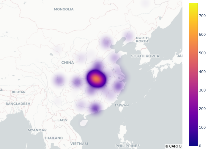
With the rest of the data parsed, I used Plotly to build a final heatmap (data from morning of 01/28). We can see from this that the model has clearly picked up the epicenter and the surrounding virus activity nearby.
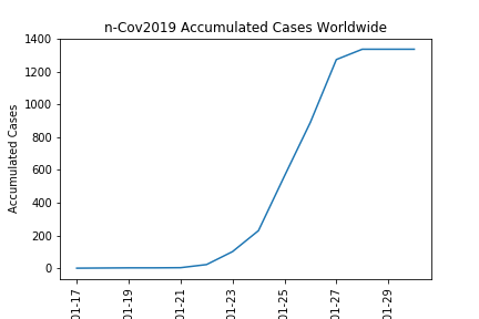
I plotted the accumulated cases over time:
Finally, I made a GIF heatmap of the virus activity over time (note the scale bar changes overtime):

Future:
In the imminent future, I plan on releasing a Flask app on my website with the data, stay tuned! Additionally, I will update it with the most recent data released from 01.28.2020.