I recently started biking…in Los Angeles. Los Angeles could be one of the most bike-friendly cities in the United States: it boasts plenty of annual sunshine, it has a mostly flat terrain, and quite mild weather. Unfortunately, many parts of the city lack proper bike infrastructure, making it dangerous when it comes to traffic collisions and traffic violence. In 2021, over 230 people lost their lives to the streets of Los Angeles.
With this in the background, I wanted to figure out the most dangerous streets in Los Angeles. I had been following the Streets For All Twitter account for a while and knew that they had a bot which posted any traffic violence against involving pedestrians or bikes. This account had records dating back to just over one year. So I started with that (old results here). I used the Twitter API to extract all of the Tweets from the bot account, and then used the Google Maps API to convert the text-based location to a series of latitude and longitude.
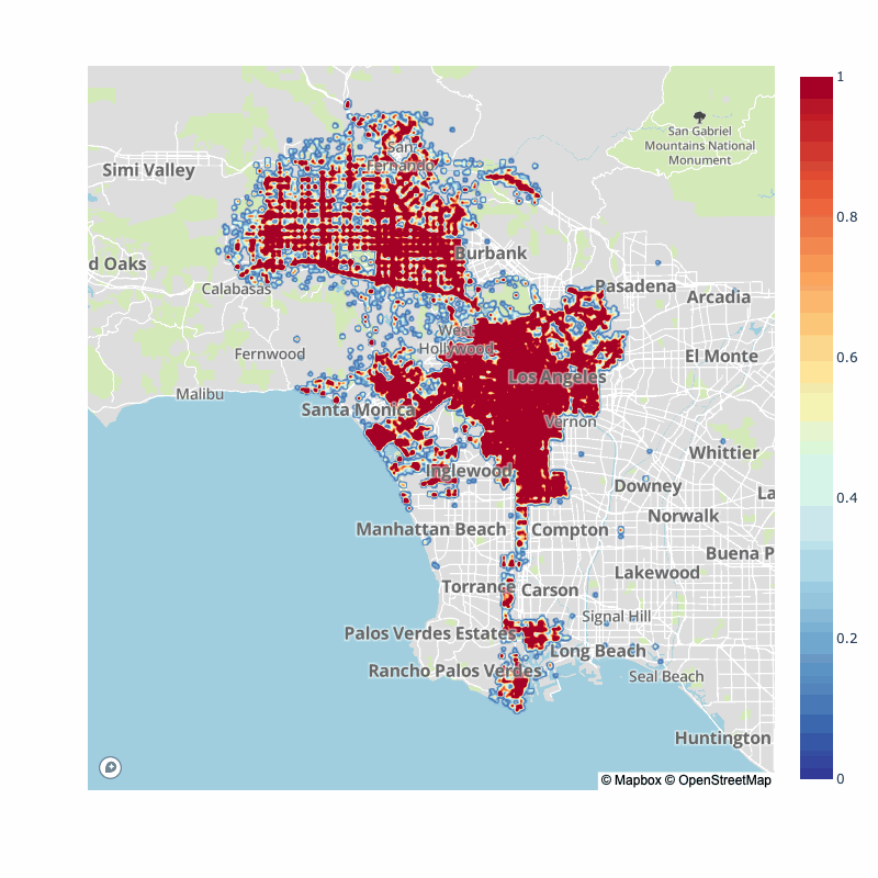
I soon stumbled upon LA City’s records, dating back 2010-Present. This uses MO codes to detail the accident. After converting the MO codes for vehicle collision with pedestrian, and bikes, I had all the data needed to plot all collisions:

For plotting, I am using Plotly with the Mapbox API.
How does this look year over year since the data started? First, a quick decline occurs after 2013 followed by similarly looking collision patterns year over year. We can see some streets always have a a dense amount of collisions. Venice, Figueroa, Pico, Olympic, Wilshire, Santa Monica and Vermont appear to be big incident street year over year.
Of course, many have pointed out that the pandemic has switched typical traffic flows for city, as such, here is the pre-pandemic vs. post-pandemic collision map densities:
| 2017-2020 | 2020-2022 |
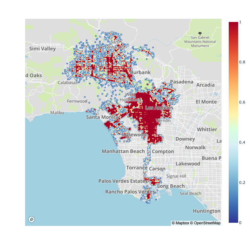 | 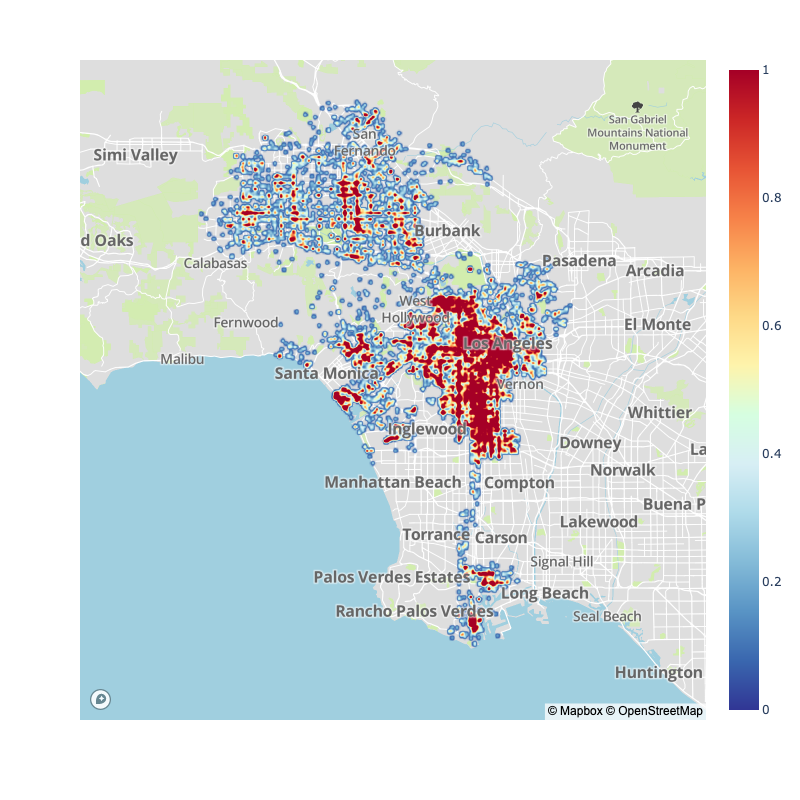 |
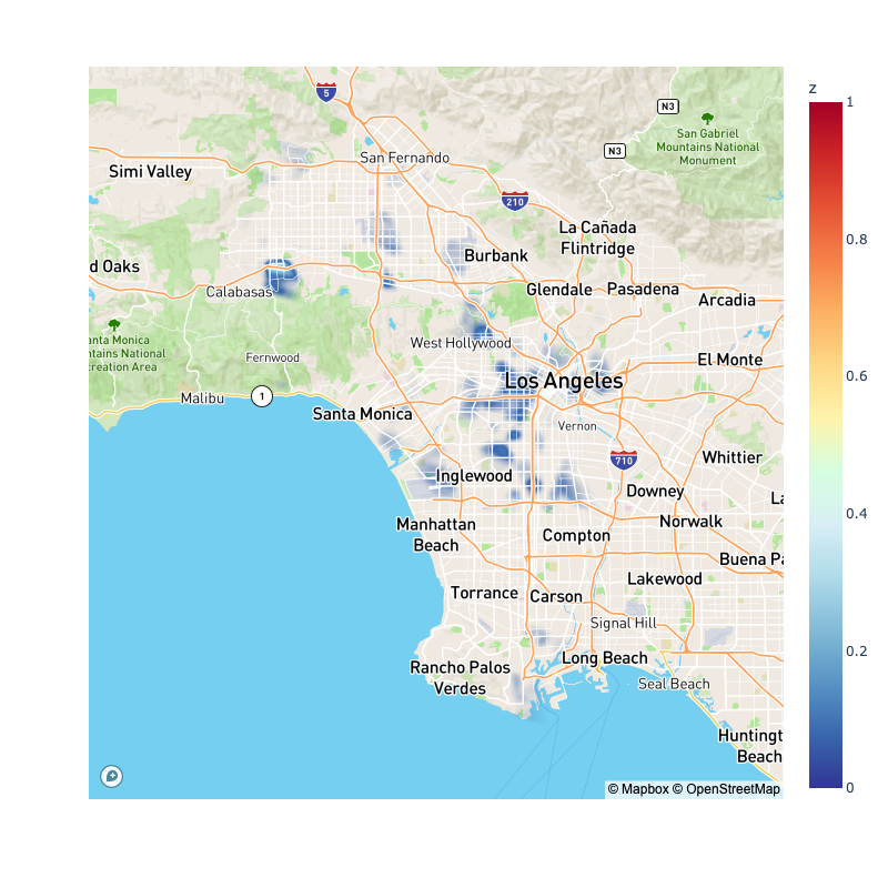
Just because a street has more absolute collision does not mean it has increased probability of collisions. To capture the probability of collisions, I’m going to make an assumption: that streets with more vehicular traffic should have more chances of vehicle-pedestrian interaction, so if I normalize the collision by the traffic flow, I should arrive at a value that is more representative of the probability of collision.
Luckily, LADOT has data on such traffic volume. Unfortunately, this data appears to start in 2011 and stop in 2016. It does not survey the same street year over year and seems sporadic in the streets surveyed over time. It has not been updated since 2016 giving a mixed snapshot of the traffic throughout Los Angeles.
The first plot will assume that the traffic from 2011-2016 more or less is constant throughout the collision data from 2010-2020:

To make a plot like this I had to engineer a trick: the data from the traffic flow does not overlay perfectly from the data from collisions, naturally. In order to be able to divide both data I needed to figure out an interpolation scheme for each. For traffic flow data I did a ‘nearest’ interpolation grid approach. I did this for two reasons, first I thought of the traffic flow data as a ‘graph’ in that the flow from one point to its nearest neighbor must be related: cars must travel between these points to an extent. The other reason for this interpolation, is that unlike the collision data, the traffic data was rather dense (in my opinion). For the collision data I opted for a Kernel Density Estimation (KDE) approach. Here, I made the assumption that an area near a collision point must be less safe, and thus a collision within a certain radius of another collision, is more likely to occur.
In the second plot, realizing that we have a snapshot of a traffic count done late 2016 (600+ intersection), and we also have collisions for just 2016, we will repeat the plot with just the snapshot for the 2016 year:
We will do the same thing with 2015, 2014, 2013, 2012, and 2011, but animated to see how the most dangerous areas changed over time:
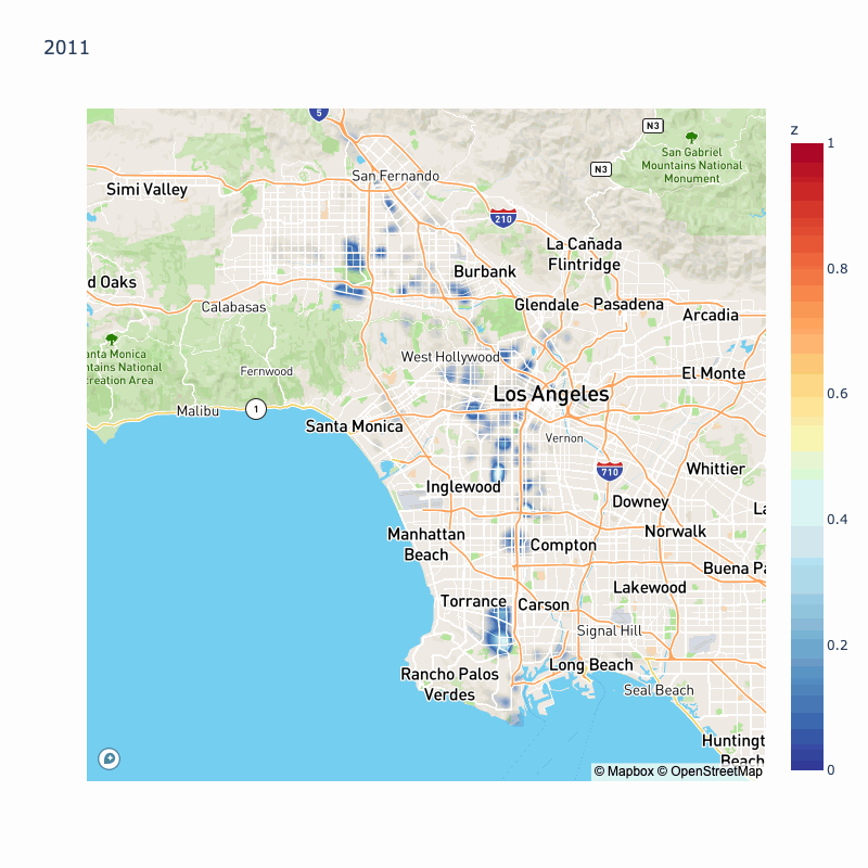
We can see year over year variation in probability of collisions, however some areas are highlighted throughout most of the year: Koreatown, Silverlake, South LA, East LA.